
UX Writing
Explore a selection of mini-projects based on prompts from the Daily UX Writing Challenge
The NFL App
Scenario
A user is a working parent, and a big sports fan, in the midst of their favorite sports season who can no longer attend games.
Write a promotional screen for an app that lets the user choose teams, sends game reminders, real time score updates and highlight videos.
My Analysis
I took this prompt as an advertising challenge.
(1) - Using the app’s name as the headline would’ve been a waste of copy real-estate. Instead, I designed a narrative headline that’s catchy and alliterative. It explains the purpose of the app by plunging the user into their own little fairy tale.
(2) - Rather than simply pasting the list of features given in the prompt, I challenged myself to smoothly and quickly convey the benefits of those features. "Live” and “personalized” sound snappy, upbeat, and convenient. “Kickoff” and “highlight reel” keep the vibe going while speaking directly to the sports fan. Functionality is communicated without a scrap of jargon.
Overall, I avoided antagonizing the target user with direct acknowledgements of their hectic life. Instead, I presented them with what might just feel like a luxury - having something brought to them.
All they have to do is tap that familiar “install” button (3).

A Canceled Flight
Scenario
A traveler is in an airport waiting for the last leg of a flight home when their flight gets abruptly canceled due to bad weather.
Write a message from the airline app notifying them of the cancellation and what they need to do next.
My Analysis
A flight cancellation needs to be communicated clearly and directly.
(1) - For the notification headline, I surfaced the flight’s destination. When users have multiple connecting flights, this is a better at-a-glance identifier than a flight number, date, or time.
(2) - After the blow of the cancellation, “we have a solution” is directly reassuring. “Tap here” ensures that the user doesn’t dismiss the notification.
(3) - In the app, the user’s train of thought is reaffirmed. A red card at the top of the screen confirms the canceled flight and gives both visual and written explanations.
(4) - Changing one flight has a domino effect. The user needs to know that the app has accounted for the chain reaction.
(5) “Claim your seats” reassures the user that a solution is available. The word “your” suggests that the airline has already acted on its word and made space for the user.
(6) - A direct user journey is ideal, but it requires some assumptions. When these assumptions don’t fit the user’s needs, they can click “see other solutions”.

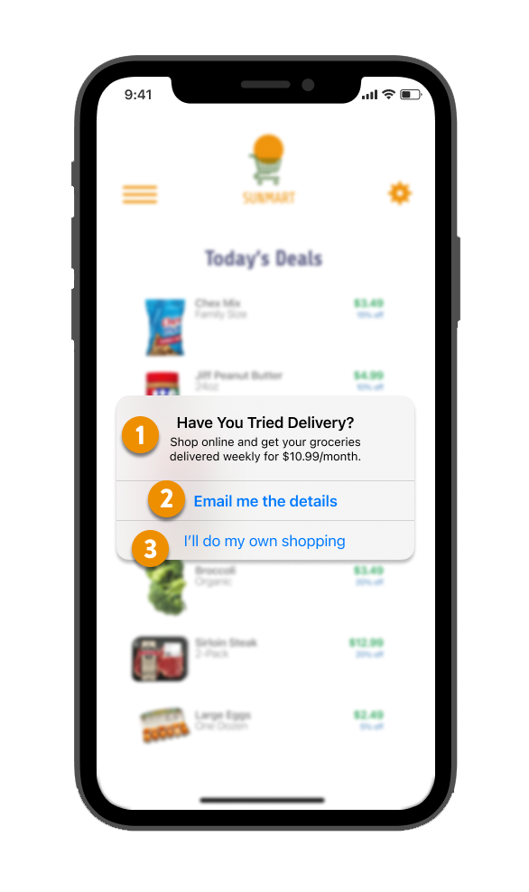
Grocery Delivery
Scenario
A user is in their favorite supermarket. They open the supermarket’s app on their phone to see what’s on sale and are greeted by a promotion.
Write a promotional home screen for a subscription service that delivers groceries to the user once-a-month for a flat fee.
My Analysis
I proposed a few changes to this prompt. Monthly grocery delivery is a recipe for moldy fruit and spoiled milk. I chose to advertise weekly delivery, paid monthly. I also designed around a native ios alert instead of a “promotional screen”. If I were a busy shopper, I’d be frustrated by an ad screen that took me away from what I was doing.
(1) - The heading is meant to convey the helpful, wholesome, and reliable voice of a good grocery store. There's only one opportunity to convince the user that they're seeing a truly a helpful suggestion. The body is kept short. I want to clearly convey necessary information while I still have the shopper's attention
(2) - My call to action is sensitive to the fact that the user is currently shopping; I can't imagine committing to a paid service in the middle of the grocery store. "Email me the details" lets the user defer their decision, while giving the provider the opportunity to send more aggressive marketing.
(3) - "I'll do my own shopping" might be unnecessarily flippant when "dismiss" would suffice, but it’d be a satisfying conclusion for a customer who’s truly annoyed at being propositioned by an algorithm.
Crash Report
Scenario
The user works in graphic design. While critiquing a design in a mobile app, their phone abruptly turns off. When they restart the phone, they reopen the app.
Write a message that the user will read immediately upon opening the app. What do they need to know? What steps (if any) do they need to take to recover their content? What if they can't recover the content?
My Analysis
Re-opening a crashed app is an emotional whirlwind. In both the best-case and worst-case scenarios, copy drives the user’s experience.
In the best case, you can pick up where you left off. I took this as an opportunity to reinforce the user’s commitment and connection to the app.
(1) - My headline is reassuring, and the explanatory subheading is ever-so-slightly headstrong.
(2) - I conclude with a firm pat on the back. Let’s keep going, together.
In the worst case, work has been lost.
(3) - My short headline eases the user into the catastrophe. The sub-heading is as clear and concise as possible. Your work is gone.
(4) - There’s a valuable opportunity to collect data about the crash, but asking for it could come across as kicking the user while they’re down. I carefully worded the request as an affirmation, seeking to rebuild trust.
(5) - The CTA at the bottom of the page is flat and unemotional. Life goes on.
